Angular Material Icon Animation

Below is the fruit of some experimentation with Angular, Material Design Icons and Greensock. I was looking into how to animate icons using an angular directive. Of course, this will work perfectly well if the directive is taken out.
index.html
<html>
  <head>
    <link    href="bower_components/mdi/css/materialdesignicons.min.css"
    media="all"
    rel="stylesheet"
    type="text/css" />
    <link href="./styles/main.css"
          media="all"
          rel="stylesheet"
          type="text/css" />
  </head>

  <body ng-app='app'>
    <heart-pulse></heart-pulse>
    <!-- bower:js -->
    <script src="bower_components/angular/angular.min.js"></script>
    <script src="bower_components/jquery/dist/jquery.min.js"></script>
    <script src="bower_components/TweenMax.min.js"></script>
    <!-- endbower -->

    <!-- build:js({.tmp,app}) scripts/scripts.js -->
    <script src="scripts/app.js"></script>
  </body>
</html>
app.js
angular.module('app', ['ngAnimate'])
  .directive('heartPulse', heartPulse);
function heartPulse() {
  return {
    template: '<i class="pulse mdi mdi-heart-outline material-icons md-36"></i>
                 <button>Toggle Beat</button> ',
    link: link
  }
  function link(scope, element, attrs, controller) {
    pulsing();
    //Start the pulsing animation on the icon element
    function pulsing() {
      TweenMax.fromTo(element.find('i'), 0.7, {
        boxShadow: "0px 0px 0px 0px rgba(0,213,0,0.3)",
        scale: "0.6"
      }, {
        boxShadow: "0px 0px 20px 10px rgba(0,213,0,0.5)",
        scale: "0.8",
        repeat: -1,
        yoyo: true,
        ease: Linear.easeNone
      });
    }
    //Stop the pulsing animation and rotate for good measure
    function heartBroken() {
      TweenMax.to(element.find('i'), 0.7, {
        boxShadow: "0px 0px 0px 0px rgba(0,0,0,0.3)",
        scale: "1.0",
        rotation: "360"
      });
    }

    var toggle = element.find('button');
    $(toggle).on("click", function() {
      var target = $(element.find('i'));
      if ($(target).hasClass('mdi-heart-outline')) {
        $(target).removeClass('mdi-heart-outline');
        $(target).addClass('mdi-heart-broken');
        $(target).css({ "background-color": "red" });
        heartBroken();
      } else {
        $(target).removeClass('mdi-heart-broken');
        $(target).addClass('mdi-heart-outline');
        $(target).css({ "background-color": "green" });
        pulsing();
      }
    });
  }
}
app.css
body {
  padding-top: 20px;
  padding-bottom: 20px;
}

button {
  background-color: white;
  border: solid 1px green;
  padding: 10px;
  margin-top: 20px;
  display: block;
  cursor: pointer;
}

.pulse {
  background-color: green;
  color: white;
  border-radius: 50%;
  padding: 3px;
  margin-left: 20px;
}

// Rules for sizing the icon.
.material-icons.md-18 { font-size: 18px; }
.material-icons.md-24 { font-size: 24px; }
.material-icons.md-36 { font-size: 36px; }
.material-icons.md-48 { font-size: 48px; }
Checkout the codepen.io sample here.
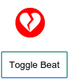
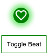
Below are the screenshots of the results.
aww....